
In the digital age, presenting data in an easy-to-understand way is critical. A pie chart generator not only makes creating charts simple but also helps to use a pie chart generator efficiently for business, education, and personal projects. Whether you’re summarizing survey results, financial data, or demographic information, this generator ensures your data is visually appealing and easy to interpret.
This article explores how it helps to use a pie chart generator, its benefits, and practical tips to make your charts professional and effective.
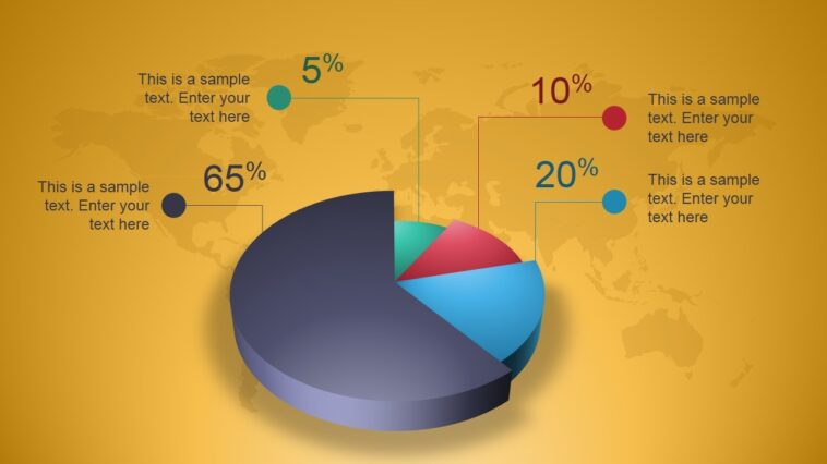
Why a Pie Chart Generator is Essential

A pie chart generator helps to:
- Visualize proportions clearly – Pie charts show parts of a whole at a glance.
- Save time – No manual calculation or design skills are needed.
- Enhance presentations – Charts generated look polished and professional.
- Improve understanding – Data is easier to digest when shown visually.
This generator is more than just a drawing tool – it’s a data communication tool.
How It Helps to Use a Pie Chart Generator for Business
Businesses often work with large amounts of data that need to be explained clearly. Knowing how it helps to use a pie chart generator makes business reports easier to understand because visual charts highlight proportions without requiring detailed explanations.
Tracking Sales Performance
A pie chart generator helps businesses present sales distribution in a simple visual format. Managers can quickly see which products or regions generate the most revenue, making performance reviews faster and easier to understand.
Analyzing Expenses

Expense data becomes clearer when shown as parts of a whole. Generator helps visualize how budgets are divided between categories such as operations, marketing, and staff costs, allowing better financial planning.
Measuring Customer Feedback
Survey results are easier to interpret when shown visually. It helps businesses present customer satisfaction levels clearly so teams and stakeholders can quickly understand overall feedback.
This approach is especially helpful when presenting feedback to:
- Management teams evaluating service quality
- Marketing departments planning improvements
- Clients who expect clear performance reporting
Visualizing feedback results also helps teams identify patterns and areas that require attention.
Comparing Products or Services
Businesses often need to compare product or service performance. A pie chart generator highlights which offerings represent the largest share, making it easier to identify popular options and plan future decisions.
Using this generator simplifies reporting and helps teams and clients understand business data at a glance.
How It Helps to Use a Pie Chart Generator in Education

Teachers and students benefit from using a pie chart generator in the classroom:
- Simplify complex data – Convert numbers into easy-to-read visuals.
- Improve learning retention – Students remember visual information better than raw data.
- Create assignments or projects – Students can present findings professionally.
- Make presentations engaging – Adding charts increases attention and comprehension.
This way students and educators can save time and improve clarity.
Key Features That Help to Use a Pie Chart Generator
A good pie chart generator offers features that make chart creation seamless:
- Easy data input – Enter numbers and categories quickly.
- Customizable design – Change colors, fonts, and labels.
- Multiple chart types – Some generators also include 3D, donut, or interactive charts.
- Export options – Save charts as images, PDFs, or embed in websites.
- Responsive previews – See how it looks before finalizing.
Together, these functions reduce preparation time and help users create clear and consistent charts without needing advanced technical or design skills.
Practical Examples of How It Helps to Use a Pie Chart Generator
Example 1: Business Survey Results
A company conducts a customer satisfaction survey. Using a pie chart generator:
- 40% very satisfied
- 30% satisfied
- 20% neutral
- 10% dissatisfied
It immediately shows proportions, making it easy to interpret at a glance.
Example 2: Budget Allocation
A nonprofit tracks monthly expenses. A pie chart generator displays:
- 50% operations
- 25% marketing
- 15% staff
- 10% miscellaneous
The chart helps stakeholders quickly understand fund distribution.
Example 3: Education
A teacher collects data on student participation in extracurricular activities. A pie chart displays:
- 35% sports
- 30% arts
- 20% music
- 15% science clubs
This helps students understand group trends visually.
Tips to Maximize How It Helps to Use a Pie Chart Generator

- Keep it simple – Avoid too many slices; 5–7 segments are ideal.
- Use contrasting colors – Ensure each section stands out.
- Label slices clearly – Always add percentages or values.
- Match style to your audience – Professional look for business, playful colors for education.
- Double-check data – Accuracy is essential.
By following these tips, a pie chart generator truly helps you create effective charts every time.
Common Challenges and How a Pie Chart Generator Solves Them
Working with data often brings practical difficulties, especially when charts need to be created quickly and presented clearly. A pie chart generator helps solve several common problems that businesses, students, and professionals encounter when preparing visual reports.
Challenge 1: Manual chart creation is time consuming
Creating charts manually often requires calculating percentages, designing layouts, and adjusting labels. This process can take a significant amount of time, especially when data changes frequently. This generator automates calculations and produces a finished chart within seconds, allowing users to focus on analyzing results instead of formatting visuals.
Challenge 2: Data may be hard to interpret
Large tables of numbers can be difficult to understand at a glance, particularly during presentations or meetings. A pie chart generator turns raw data into clear visual segments that show proportions immediately. Labels and percentages make the information easier to read and reduce the need for lengthy explanations.
Challenge 3: Charts look unprofessional
Poorly formatted charts can reduce the impact of a report or presentation. A pie chart generator provides consistent layouts, readable labels, and customizable styles that help charts look clean and professional without requiring design experience.
Conclusion
Understanding how it helps to use a pie chart generator is essential for anyone dealing with data. From business reports to classroom projects, a pie chart generator simplifies the process, saves time, and ensures clarity.
By choosing the right tool, customizing charts effectively, and following best practices, you can make your data visually engaging and easy to interpret. A pie chart generator isn’t just a convenience—it’s a powerful way to communicate insights clearly.